
I started fiddling with invitations in June of last year. The style has stayed more or less the same, with minor tweaks over the months. The style of the invites was dictated by my chosen print method: letterpress. To keep costs down, I knew I had to keep it limited to one to two colors because each additional color means the invite needs to be run through the press another time, which equals more money. Since I designed the invite myself, I also knew I had to take stock of my talent -- which does not include illustrations!
So I needed a simple design with minimal colors. To spice things up, I bought a font set and got to work.
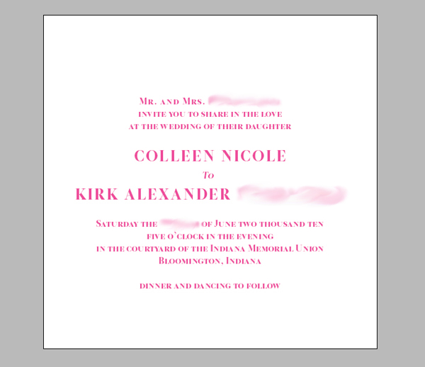
The first attempt was a mix of calligraphy and typography.

I liked it enough and let that design sit for several months. Returning to it in December, though, I realized it wasn't really capturing the high fashion look I wanted. I had to give up the calligraphy.
Back to InDesign I went and I experimented with things like all caps, small caps, and the leading (spacing between lines). I also toyed with bold colors.
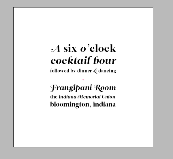
For the reception card, I wanted to depart from the formality of the invite and play with typography more.
That wraps up the beginning of my design process. The final design will be revealed later!
Did anything dictate your invitation design process?

Leitura is magic.
ReplyDelete